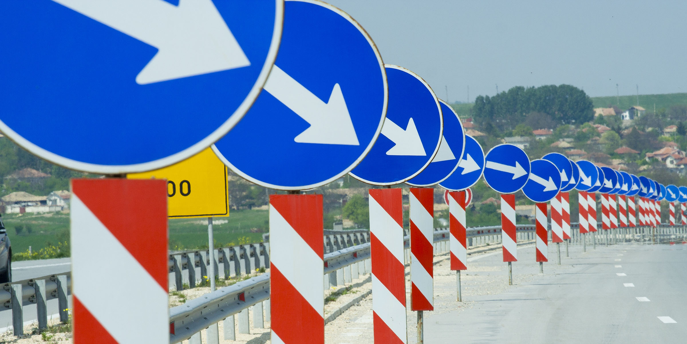
Not many people notice the simple design of road signs, but there are good reasons for that. Great design is something that tells you where you need to go in a quick, and easy to understand way. If you are traveling at 65 you really don’t have time to contemplate how lovely the green of the exit sign is.
All good graphic design should function in this way.
You want to create a simple, quick, and easy to understand message to tell your potential customer what you are selling and how to buy it. This all needs to happen just as fast as a road sign.
Good design does not stop with that simple messages, but goes deeper into the way your design is laid out too. Creating road signs within your design provides clues, or arrows, pointing where to look next. It is best to direct your viewer around the page to show off the message you want them to see.
Although English reading people start from the top left, the first place they look on a page is the upper right corner. If you think about this the next time flipping through a magazine you might notice yourself doing just this. If you keep this in mind when setting up your next ad, place your logo or an image pointing into the page. Try to keep your viewer connected to your space and not leaving paths out so that they leave to look at something else.
This all happens without much notice, but steers your customers to where you want them to look.
A good graphic designer can help build a road map and point you in the right direction. Contact us today.

